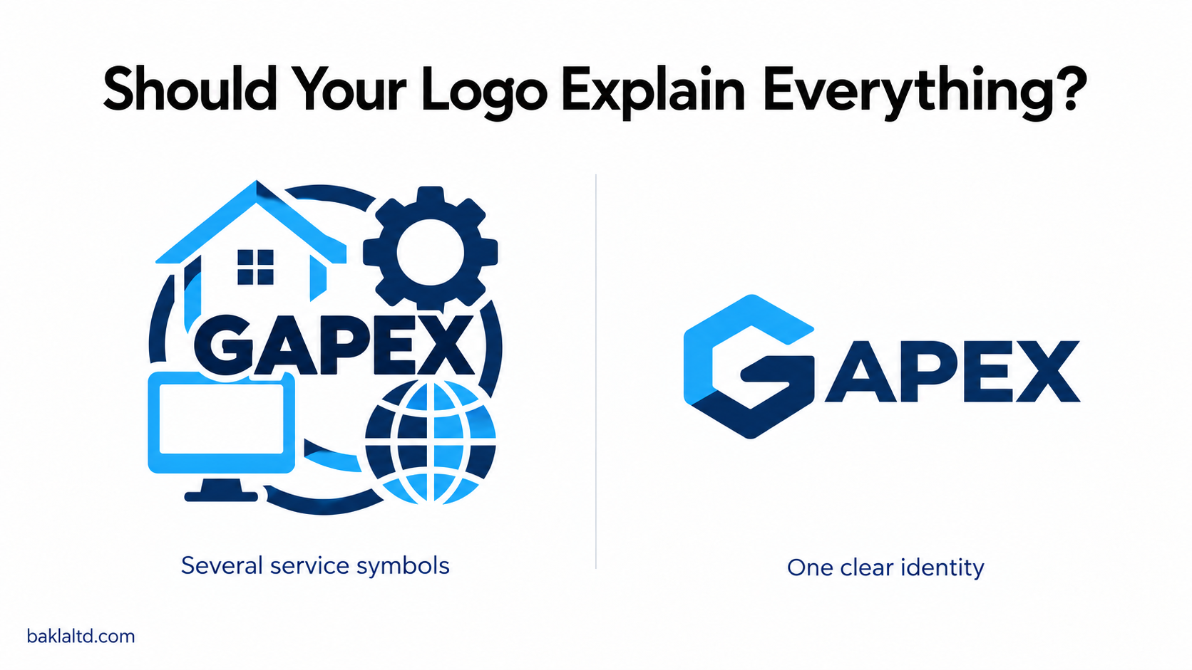
When asking for a logo, it is easy to start listing everything your business does, then expect the designer to fit it all into one image. A construction company wants a house, a supplier wants its products included, while a technology company asks for a computer, a globe and something representing the internet.
The thinking makes sense, you want someone to look at your logo and immediately understand your business. But a logo’s main job is to identify your business, and it does not have to explain every service you offer.
Your logo is part of the introduction
Think about how people discover your business, through your website, a signboard, a proposal, a social media page or a product. Your logo usually appears alongside your name, information and images, so it does not have to carry the whole introduction alone.
A symbol connected to your work can be useful, especially when it helps people understand an unfamiliar business. However, you can also use a distinctive name, initials or an abstract mark, then let the surrounding communication explain what you do.
The question is whether the design gives your business a clear identity and works wherever you need to use it.
Start with your business before choosing a design
Before discussing colours and symbols, explain your business to the designer, who your customers are, what you offer and how you want to be perceived. A playful identity may suit a children’s activity centre, while a professional services firm may need something more restrained.
Also consider where the business is heading, because a logo built around one product can become limiting when you introduce others. You do not need to include your future plans in the design, but it helps to choose an identity that can grow with the business.
Give the designer a clear brief rather than asking them to guess what “something nice” means.
Keep the design clear
Adding more elements does not necessarily make a logo more meaningful. A design with several symbols, a long slogan and decorative lettering may look impressive when enlarged, but become difficult to read on a business card or social media profile.
Each element should have a reason to be there, and the business name should remain readable. If removing something makes the logo clearer without losing its identity, that is worth considering.
Simple does not mean plain or careless, it means the design communicates without unnecessary detail.
Choose colours and lettering with purpose
Choose colours that suit the identity you want to build, then use them consistently across your business materials. There is no single colour that automatically makes a business trustworthy or successful, and a colour you personally love may not always be the best fit for your audience.
Lettering deserves the same attention, because people should be able to read your name without struggling. Decorative fonts can work in the right setting, but check that they remain clear at smaller sizes and do not give your business an unintended character.
A useful test is to look at the logo in one colour, because it should still be recognisable when colour printing is unavailable.
Test it where you will use it
Do not approve a logo only because it looks attractive on a large presentation mockup. Ask to see it on a plain background and at the sizes your business actually needs, including a website header, a document and a small social media profile.
If your name is long, you may need a compact version for smaller spaces, alongside the full logo. These versions should belong to the same identity rather than looking like different businesses.
The design also needs to work on light and dark backgrounds, without losing important details or becoming difficult to read.
Look for an identity of your own
It is fine to share examples with a designer to show the style you like, but copying another company’s logo can leave your business looking like an imitation.
Common symbols are not automatically wrong, a house can still be part of a construction company’s identity. What matters is how the design is developed and whether it is distinctive enough within your market.
Ask whether the proposed logo was created for your business, uses stock artwork or contains elements with licence restrictions, so you understand what you are receiving.
Get the files your business needs
Once the design is approved, request more than a picture sent through WhatsApp. You should receive suitable files for printing and digital use, including a scalable vector version and transparent image files.
It also helps to have the colour codes, font information and a short guide showing how the logo should be used. Confirm the agreed usage rights and any restrictions, then keep the files somewhere your business can access when working with different printers or service providers.
These details make it easier to keep your branding consistent after the design project ends.
Choose for the business, not only for yourself
You should feel comfortable with your logo, but personal preference should be considered alongside readability, relevance and practical use. When reviewing options, ask what makes each one suitable for your customers and how well it represents the business.
Your logo does not need to tell your whole story, it needs to give people a clear and recognisable starting point. The rest of your brand, from your words to the quality of your service, gives that identity its meaning over time.
For logo design and corporate branding, contact BAKLA LTD at sales@baklaltd.com. We can discuss your requirements and share a suitable quotation.